Quick Summary: You might have too much information. Keep your website simple and make it easy for prospective students to navigate and find information they want.
The problem:
Prospective students are one of the key audiences that many of our University of Santa Cruz websites are aimed at, and research shows that higher education websites rarely meet their expectations.
The discussion:
The latest E-Expectations Trends Report from Ruffalo Noel Levitz (RNL) shows that most high school students want to rely on websites as a go-to resource.
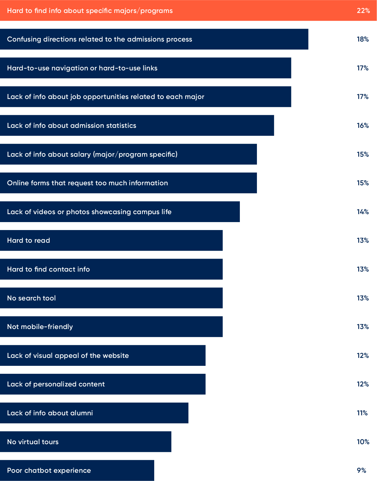
Yet, there are things that frustrate prospective students about higher education websites.

Image source: Modern Campus
Chart showing what students said when they were asked what frustrates them most about higher education websites. Some of the notable and more applicable top concerns about websites were:
- Hard to find information about specific majors/programs
- Hard-to-use navigation or hard-to-use links
- Online forms that request too much information
- Hard to read
- Hard to find contact information
- Not mobile friendly
Suggestions
While some of these suggestions may be specifically for academic units that provide program information, the advice can apply to almost all of our websites.
- Keep your website simple and easy to navigate
- Make your website accessible
- Optimize for mobile experiences
- Show ways that programs connect to job opportunities
Keep learning
- What frustrates students most about higher ed websites, Modern Campus
- E-Expectations Trends Report, RNL