Examples of visual elements available in the UCSC WordPress theme including guidance on how you might use them in laying out a page.
On this page
Examples of content layout in WordPress
Web pages are built in the UCSC WordPress environment by using what WordPress calls a “Block Editor.”
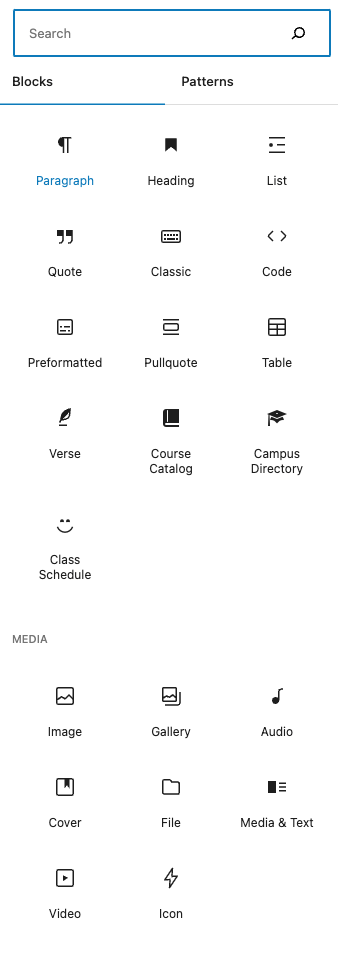
Blocks
Blocks are the components used for adding content to the Block Editor. Blocks are things like: headings, paragraph text, lists, images, columns, and more.
Patterns
Patterns are pre-designed layouts that are made up of blocks.
Get inspired
See how other UC Santa Cruz websites are using the elements on this page to draw inspiration.
Commonly used blocks
The components in WordPress that you’ll be using to create layouts on your pages
Headings and Paragraphs
Headings help communicate how the content on your page is organized.
Paragraphs are used for most of the body copy on your page.
Both have a default font and size to align with UC Santa Cruz brand and identity standards.
Related icons
Lists
Lists can organize your copy in numbers (ordered) or bulleted (unordered) lists.
- Ordered list item 1
- Ordered list item 2
- Ordered list item 3
- Unordered list item 1
- Unordered list item 2
- Unordered list item 3
Related icon
Columns
The columns block allows you to insert text, media, and other types of content on your page, up to six columns.
You can choose several column width size variations to start with: 100, 50/50, 30/70, 70/30, 33/33/33, 25/50/25.
Related icon
One column layout
A one column layout can be used to call out and prioritize a specific idea on your page. It can show priority in being the only content you want to highlight.
Two column layout
A two column layout splits the priority of two ideas on your page. You can choose to split the columns 50/50, 30/70 or 70/30.
In mobile, the columns will stack on top of each other, with the columns presented left to right.
Two column layout
A two column layout splits the priority of two ideas on your page. You can choose to split the columns 50/50, 30/70 or 70/30.
In mobile, the columns will stack on top of each other, with the columns presented left to right.
Three column layout
A three column layout splits the priority of three ideas on your page. You can choose to split columns 33/33/33, or 25/50/25.
In mobile, the columns will stack on top of each other, with the columns presented left to right.
Three column layout
A three column layout splits the priority of three ideas on your page. You can choose to split columns 33/33/33, or 25/50/25.
In mobile, the columns will stack on top of each other, with the columns presented left to right.
Three column layout
A three column layout splits the priority of three ideas on your page. You can choose to split columns 33/33/33, or 25/50/25.
In mobile, the columns will stack on top of each other, with the columns presented left to right.
Column example: Two column layout, with left image, text, and call to action

This layout splits the columns 33% – 66%, allowing you flexibility and control over how your image is placed alongside the text.
In mobile, the stacking order would be: heading, image, text, call to action link.
Column example: A three column layout, using the (bulleted) list block, with a headline
When there are several content ideas to present at an equal priority, group common ideas together with a clear headline. This can be completed in a one, two, or three column layout to show association. Try to keep lists short to reduce the volume of content users have to interact with.
Types of cheeses
- Mozzarella
- Havarti
- Limburger
Types of breezes
- Moderate
- Light
- Gusts
Types of sneezes
- Explosive
- Loud
- Quiet
Buttons
Buttons help your users take action on your page. They can be created in a variety of sizes with colors aligned with the UC Santa Cruz brand and identity standards.
Related icons
Icons
Icons are visual cues that help communicate an idea. They can call out an idea, or break up text on a page. When you use icons make sure you base them on metaphors that people understand, or introduce them together with more descriptive text.
Examples
Right arrow
Calendar
Pencil/Edit
Laptop
News
Example 1: There are a couple options in how to display news. This is a RSS feed sourced from UCSC News Center, built using the RSS feed block in a one column layout in WordPress. Images are not currently supported with the RSS feed.
- Carrie Partch, professor of chemistry and biochemistry at UC Santa Cruz, is among 26 top scientists chosen by the Howard Hughes Medical Institute (HHMI) to be HHMI investigators and receive the support needed to move their research in creative new directions and make groundbreaking discoveries.
- During the 2023-24 academic year, UC Santa Cruz continued to make consistent progress in accelerating the path to decarbonizing the University’s infrastructure focusing on the full decarbonization and electrification of the campus.
- The award, launched in 1996, highlights the university’s long tradition of innovative and creative teaching and honors UC Santa Cruz instructors who have demonstrated exemplary and inspiring teaching.
Example 2: This is news sourced from posts that are created on your website, using the Latest Posts block. There are a variety of options on how to display posts, and images are supported.
- Primary navigation best practices
 The best way to set up your navigation depends on your goals. There isn’t a one-size-fits-all solution, but there are some guidelines to help users navigate your website more easily.
 - WCMS web service retiring
 The Campus Web Content Management System (WCMS) will officially retire at the end of summer in 2025.
 - Using headings to create accessible websites
 HTML headings serve as signposts in your web content. Using them correctly helps create accessible web pages.
Related icons
RSS
Latest posts
Events
Displayed in a one column block, using the Custom HTML block, this is one of several events calendar display options sourced from the UCSC Events Calendar using the Events Calendar widget builder.
Related icon
Media and text
The Media & Text block allows you to place an image or video side-by-side with text
Example 1: Media and text, set to full width
Related icon

Commencement at UC Santa Cruz
Your voices will change the world.
Commencement is different from graduation. Commencement is the celebration that graduation has, or will soon occur. Graduation is the official acknowledgment that a student’s course of study is complete and, with that, a degree conferred.
Example 2: Media with text, set to a fixed width and centered
Commencement at UC Santa Cruz
Your voices will change the world.
Commencement is different from graduation. Commencement is the celebration that graduation has, or will soon occur. Graduation is the official acknowledgment that a student’s course of study is complete and, with that, a degree conferred.
Example 3: Media with text,
Culture at UC Santa Cruz
Similar to the visuals provided in the two column layout with image, the Media and Text block gives you even more control over how your image is placed alongside the text.
Initially using a 50% – 50% column split, this block allows you to easily change the column widths.
Video embed in a 1,2,3 column layout
For displaying video content on your web pages.
Related icons
Patterns
Patterns are collections of individual blocks that are pre-styled to give you an easy layout option.
They are located next to the blocks in your WordPress page editor.

Banners
Banners are often used to show your most important idea on the page. Banners are sometimes called hero (or hero images) or billboards.
Banners are unique designs built using the Cover Block. Similar to a column, the Cover Block allows you to create a large image with a text overlay. If you use the text overlay, choose an image where the text won’t cover people’s faces, or hide the meaning of the image.
Find these patterns
Select: Patterns
Then select: Banner
Example 1:

Web theme design elements
Example 2: includes extra space for more copy

Web theme design elements
The Research Department is your bridge to researchers developing bold solutions for the challenges of our time.
We are your partner and advocate in realizing your research goals.
Example 3: Banner with page title and pre-text

Affiliation or relationship text
Web theme design elements
Grid
Grids are ways to present content out according to preset layouts that also respond to different screen sizes.
Find these patterns
Select: Patterns
Then select: Grid
Grid: 2-Column Grid
Individual call out
First column heading
A two column layout splits the priority of two ideas on your page. Leading with an image can break up long text, and provide context to the heading and descriptive text associated with the image
In mobile, the columns will stack on top of each other, with the columns presented left to right.

Individual call out
Second column heading
A two column layout splits the priority of two ideas on your page. Leading with an image can break up long text, and provide context to the heading and descriptive text associated with the image
In mobile, the columns will stack on top of each other, with the columns presented left to right.
Grid: 3-Column Grid

Individual call out
First column heading
A three column layout splits the priority of three ideas on your page. Leading with an image can break up long text, and provide context to the heading and descriptive text associated with the image
In mobile, the columns will stack on top of each other, with the columns presented left to right.
Individual call out
Second column heading
A three column layout splits the priority of three ideas on your page. Leading with an image can break up long text, and provide context to the heading and descriptive text associated with the image
In mobile, the columns will stack on top of each other, with the columns presented left to right.
Individual call out
Third column heading
A three column layout splits the priority of three ideas on your page. Leading with an image can break up long text, and provide context to the heading and descriptive text associated with the image
In mobile, the columns will stack on top of each other, with the columns presented left to right.
Grid: 3-Column Grid with background
Use the 3-column grid with background to feature content with a background visual.
Our voices
We are bold, innovative, and diverse change makers that are purpose driven and persistent.
Our voices will define the century.
Will define
We lead at the intersection of innovation and justice, seeking solutions and give voice to the challenges of our time – leading to transformative change.
The century
Where social and environmental justice are taught and lived. Where academic rigor and experimentation offer the adventure of a lifetime.
UC Santa Cruz is a complex and diverse place.
Rooted in this complexity are some foundational attributes that make us distinctive.
Grid: Statistics
Used the Statistics Pattern to associate an image with an overlay that quickly calls out facts.

123
Numerical fact 1
456
Numerical fact 2
78910
Numerical fact 3
11%
Percentage call out
12px
Metric call out example
13lbs
Metric call out example
Grid: 3- column with dividers
First column heading
A three column layout splits the priority of three ideas on your page.
In mobile, the columns will stack on top of each other, with the columns presented left to right.
Second column heading
A three column layout splits the priority of three ideas on your page.
In mobile, the columns will stack on top of each other, with the columns presented left to right.
Third column heading
A three column layout splits the priority of three ideas on your page.
In mobile, the columns will stack on top of each other, with the columns presented left to right.
Media
Media patterns associate text with a larger image or video to call out key information on your web page.
Find these patterns
Select: Patterns
Then select: Media
Media: Image with text, and heading
Use for specific information that you want to highlight on your website including an image in context to the content.
Creating real change
Students at UC Santa Cruz learn from incredible faculty, develop new skills through hands-on research opportunities, and have a track record of making an impact. What kind of a pathbreaker, innovator, or changemaker will you become?

Media: Featured video, with heading, text, and call to action
Use for specific information that you want to highlight on your website, that could include video.
Creating real change
Students at UC Santa Cruz learn from incredible faculty, develop new skills through hands-on research opportunities, and have a track record of making an impact. What kind of a pathbreaker, innovator, or changemaker will you become?
Page layouts
Combinations of blocks to provide a fuller page layout.
Find these patterns
Select: Patterns
Then select: Page layouts
Posts
Post patterns are an automated way of displaying multiple posts. News feeds are a common use case.
Find these patterns
Select: Patterns
Then select: Posts
Posts: display example, using the query loop block
Content in your query loop can be displayed in a variety of ways to get a desired look and feel.
-

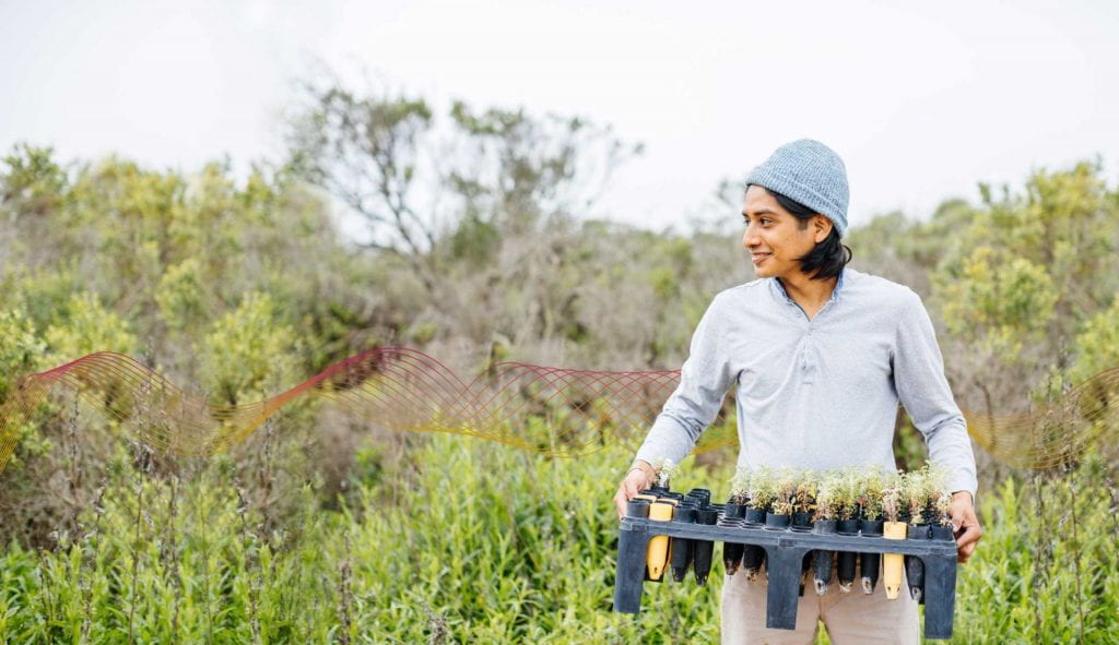
AgTech at UCSC
Our interdisciplinary expertise guides engineers, activists, farmers, and others on a path to socially responsible technology for a sustainable future.
-

Innovation & Business Engagement Hub
The Innovation & Business Engagement Hub is your bridge to the vast resources, diverse talent, and bold innovations at UC Santa Cruz.
-

Center for Coastal Climate Resilience
Building coastal resilience by engaging partners, fostering leaders, and addressing the challenges from climate change with strategic focus in 6 key areas
-

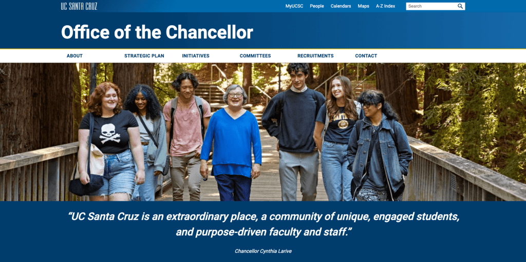
Office of the Chancellor
As the 11th chancellor of the University of California at Santa Cruz, Cynthia Larive leads an institution known worldwide for its high-impact research, for seeking interdisciplinary solutions to the world’s greatest challenges, and for its commitment to social and environmental justice.
-

Access to your website analytics
Google Analytics messaged users on April 2, 2024 noting that Universal Analytics will cease to function on July 1, 2024. There is no action you’ll need to take if you currently use the centralized Google Analytics account set up for UC Santa Cruz websites.
-
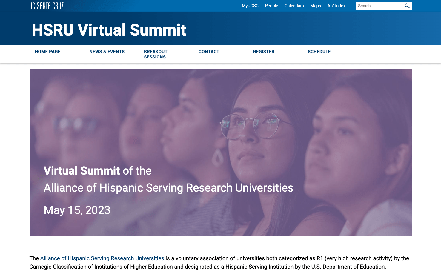
Alliance of Hispanic Serving Institutions Virtual Summit
The Alliance of Hispanic Serving Research Universities is a voluntary association of universities both categorized as R1 (very high research activity) by the Carnegie Classification of Institutions of Higher Education and designated as a Hispanic Serving Institution by the U.S. Department of Education.
Post patterns are an automated way of displaying multiple posts. News feeds are a common use case.
Text layout
Combinations of blocks to provide a fuller page layout.
Find these patterns
Select: Patterns
Then select: Text layouts
Text: Media with Text, Featured

Research
A global research university with an uncommon emphasis on undergraduate research and education, UC Santa Cruz is part of the world’s most celebrated system of public higher education, and stands among the most renowned institutions of higher learning.
Text: columns with a background image

Text: Map + Contact
Address
1156 High Street
Santa Cruz, CA 95064
Additional Info
A global research university, UC Santa Cruz is part of the world’s most celebrated system of public higher education, and stands among the leading institutions of higher learning.
Contact
Contact Info: sammy@ucsc.edu
Text: Callout
Leading at the intersection of innovation and social justice.
Text: Centered call to action
Discover our research
A global research university with an uncommon emphasis on undergraduate research and education, UC Santa Cruz is part of the world’s most celebrated system of public higher education, and stands among the most renowned institutions of higher learning.
Text: Interstitial heading
Discover our research
UC Santa Cruz is part of the world’s most celebrated system of public higher education
Text: Text layout with Call to Action
UC Santa Cruz
Discover our research
A global research university with an uncommon emphasis on undergraduate research and education, UC Santa Cruz is part of the world’s most celebrated system of public higher education, and stands among the most renowned institutions of higher learning.
Text: Text layout with background color and Call to Action
UC Santa Cruz
Discover our research
A global research university with an uncommon emphasis on undergraduate research and education, UC Santa Cruz is part of the world’s most celebrated system of public higher education, and stands among the most renowned institutions of higher learning.